
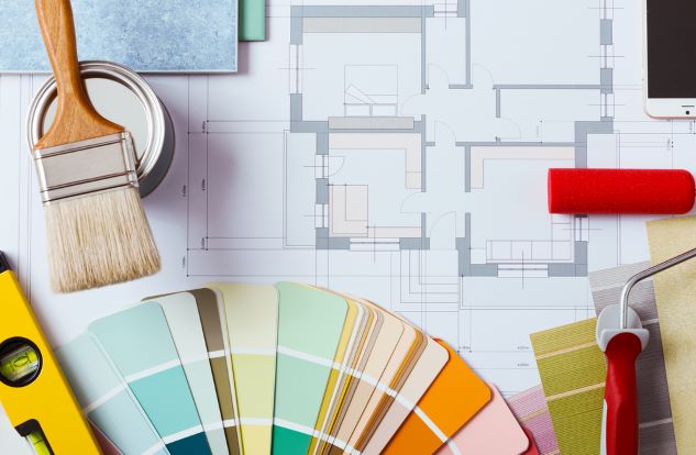
We are all good at something. It may become what we work at in life…or it may not. Choosing paint colours for your home just may not be something that makes you feel all warm and fuzzy. Colour is a powerful element in our toolkit of interior design specialties. In fact, the mood of the home can be affected to a large degree by the colours that we live with. Sometimes, over the years, we have had clients who call us to adjust a colour choice. One client was craving a lime green kitchen, so she chose the paint, bought it, and had her husband paint the room. She hated the finished look. How can that be? It was what she wanted, and the painting was completed. Turns out, the shade was too harsh for her. It’s not easy to see that coming when looking at a little paint chip, perhaps early in the morning before you jump into the car to go buy the paint. Early in the day, and approaching sunset, the quality of light is different from what it is in the middle hours of the day. This effect is not apparent until you finalize your colour choice and get it wrong, with two coats of top quality paint. The client called Mulberry Interiors and Marguerite Roberts, Colour Specialist helped her choose a more pleasing shade of lime. The more desirable shade was just a little less harsh and much more pleasing and livable, but that small adjustment in the hue made a huge difference to the finished look of the room.The client did want a lime green kitchen, and had finally dared to do it. Lime green is just one of those colours that are tricky to get right. A beige kitchen was not going to make this client happy at all. These quite subtle differences in hue have a huge effect on the overall effect and can definitely be the difference between enjoying your new paint colour and hating it. Lime is not for everyone, in the first place, but we all notice the trendy new colours and wonder if they are for us. Sometimes they are, and sometimes they are not. Sometimes a little goes a long way. Every client is different. Some have stressful jobs or lifestyles and want their home to be a serene haven. Nowadays, a great many people work from home so spend many hours in the home environment. This is very different from being out all day and just spending a few evening hours after work or on the weekends, relaxing at home. Home offices used to be an afterthought from an interior design point of view, but now they need to be comfortable as well as efficient. Many clients would prefer that their home office be beautiful, as well, and suited to their own design aesthetic. Since some of our clients have very demanding jobs they may, as a result, prefer a more subdued colour palette in there home. Or they may not. It’s a very personal choice, and sometimes the final colour palette choices are quite interesting, and not at all what the client had originally intended, simply because they did not have the confidence to make a daring colour choice that they would be happy to live with, as well as work with. Someone who works many hours in a drab environment may very well prefer a home environment that is much more pleasing and decorated in a creative and thoughtful way. Colour Specialist, Marguerite Roberts of Mulberry Interiors has many years of experience and enjoys helping clients enhance their homes in a way that suits just them.
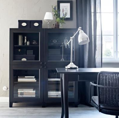 Many people find choosing paint colours stressful and end up painting the whole home an unhappy shade of tragic yellow-beige that does nothing to enhance furnishings. In fact, they are left with a sense of failure and even of stress. This diminishes their confidence, as well, and they are hesitant to try again. After awhile they stop noticing the dreary beige on a conscious level but the unhappy colour choice affects the residents of the home, nonetheless. It could have been so much better!
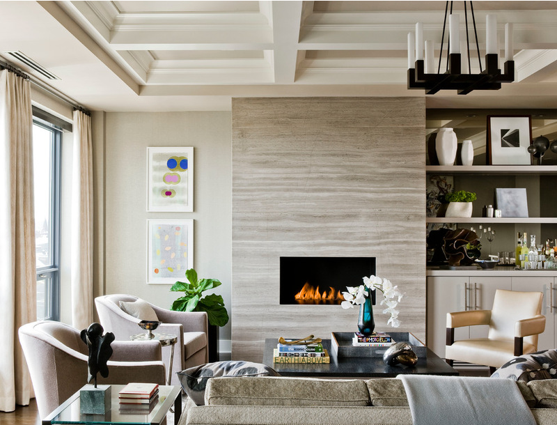 There is a fear that using darker colours will make rooms look smaller. In fact, the opposite is true, even in smaller homes. A little drama can really be our friend. There is a sense of coziness and enveloping warmth that darker colours often impart to a room. Balance is the key, though. We need to balance our darker colour choices with some lighter ones or we will have overdone it. Perhaps the daring colour is on the wall. It can also be in area rugs, artwork, accessories, or furniture. It is the interesting colour that adds the impact to the room design.
 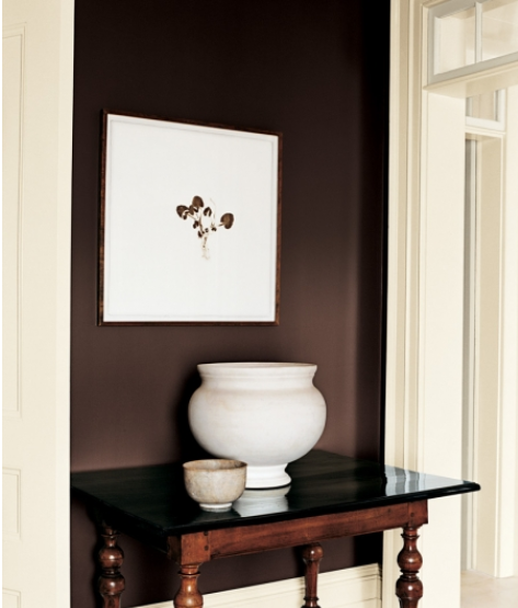 Our perception of space and how comfortable we are in the space is a function of our mood. We can affect our mood through our choice of the colours that we live with in our homes. A warm or dynamically pleasant hue with lend a sense of coziness and even optimism to an environment. We feel more relaxed around colours that we actually like. That is why it is important to take the time to effectively make good colour decisions. It’s harder than it looks and it takes a surprising amount of energy.
 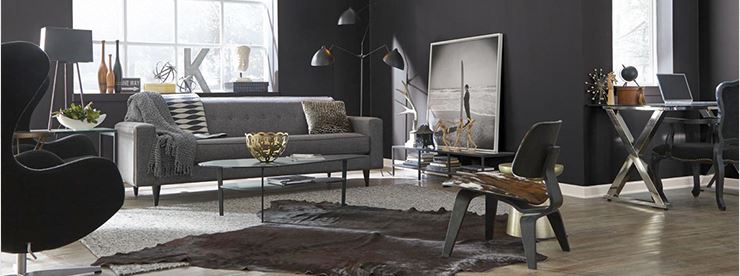 Many homes have several people living there. Realistically, it may not be possible to please all of them. Some of the home’s occupants are nearing the time when they will move out, and begin to live in their own homes. Compromise will be necessary in order to prioritize pleasing most of the occupants for colours in the main living areas, just like many other issues and decisions that occur when several people live in one home. Some of the home’s occupants may thrive in the presence of strong hues, and others may be irritated by them. Accent walls have become a topic of debate, as a result of this. Accent walls allow us to have some interesting colours or even textures in the home, while accommodating the tastes of the more conservative members of the household. One or more members of the household may want a feature wall. It could be incorporated into their own private space for them to enjoy. if that occupant is at a stage of life where they will leave the nest in a few years, they can choose a rich and interesting colour for their room, and that colour choice can be changed once they have moved out. One of the great things about paint colour is that paint is relatively easily changed, though some clients approach paint colour as if it is a permanent thing.
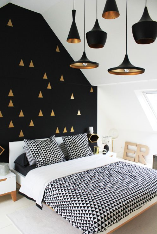 The right shades of colours such as orange, red, yellow and purple can be used very successfully to create a very pleasing home environment that can be enjoyed for many years. The choice of a beautiful and inspiring colour can make a room appear rich, muted, and elegant. Hot colours used instead as accents in artwork or on one wall can be very pleasing. Orange can be very useful in its more muted forms of terra-cotta, salmon, coral, and shrimp, but it is also spectacular in its original vibrant form in the right place. Perhaps a sunroom, porch or conservatory! Subtle warmer shades in a bedroom or bathroom flatter light skin tones. Orange tones may feel unpleasantly hot in a room which has inadequate window coverings. The same is true for the use of darker colour shades. A paint colour consultation can help to clarify what colours can improve the look of any home.
  A paint colour consultation is different every time and it is tailored to the tastes and needs of our clients. Every client has opinions and preferences. During the paint colour consultation the conversation gives the Colour Specialist clues to the client’s colour personality, whether it’s quiet, neutral, bold, bright, or what have you. The client’s favourite colours can be combined in ways that the client may not have thought of, so that the final effect shows the home to the best advantage. The colour consultant can help the client envision the final effect of various colour choices, how they will react to light. Sometimes a client have a happy remembrance of certain colours from previous homes, and, as a result, they are drawn to those colours. Conversely, they may have lived with certain colours that create unpleasant memories. Some people are embarrassed by lively colour choices in their home. They are worried about what their guests think. All of these emotions, memories and mood factors go into the paint colour consultation. Colours that we have been drawn to for years can be combined with some interesting new choices to create a fresh and vibrant new colour palette that makes us enjoy living in the home. Good communication between colour consultant and client is essential to a successful outcome. Part of the fun of interior design is interacting with clients. Many sparkling conversations have been enjoyed during the choosing of paint colours with our clients. That is just part of the process.
 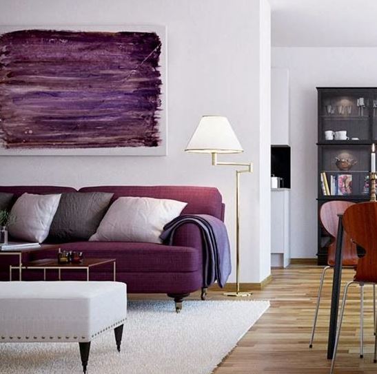 Upbeat abstract artworks with optimistic combinations of colour add a real punch to the décor, especially if they are large. Even in bedrooms, orange, lime green, purple or black can be very pleasing. These colours add a fresh, rich, or creative look, and maybe a bit of daring and surprise. Used with darker shades, these colours can add punch, vibrancy and drama. Interesting colours can even be used on the ceiling with great effect.
Many homes are poorly lit. Lighting is very important, not only to be able to see what you are working on or viewing, but also to render paint colours and colours on other home furnishings to their best advantage. 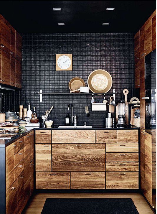 Yellow is energizing and upbeat. It is also very powerful. It’s great in just about any room, depending on the individual client and the intensity used. It can make a room very inviting as well as lend a look of spaciousness. It can also be tricky to get right. When it works, it’s a ton of fun!
 Purple is another fun but dangerous colour. Done right it can really be a WOW! It’s energy and funkiness are a huge part of its charm. It also lends a moody ambiance to any situation, so it can also be part of an elegant room design. You don’t need to be young to enjoy some purple in your home. Purple can be surprisingly sophisticated, especially in its darker hues (eggplant, for example). It can impart a feeling of luxury as well as creativity. Lilac and lavender have a similar effect to blue, restful and serene, but without the feeling of chilliness.
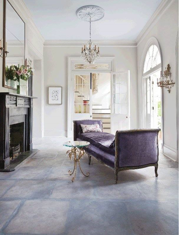 Greens can be relaxing, but many people became “greened out” from its overuse in the past, and they’re just not ready to consider green yet. An undertone of green in a pale neutral can be very spa-like and refreshing. Some retro looks incorporate shades of green. The look of the 70’s is a strong trend in design. It was a time of tremendous social change, as well as some strong design ideas. Some clients will not go there at all, but many love some of the aspects of the look. Many people have very positive memories of the 70’s. Similarly, some clients love blue while others find it too chilly. Each to his or her own. To pale a blue or green can appear juvenile and even a little tacky. It’s all in the eye of the beholder and is quite subjective.
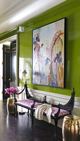 Black is one of our favourite colours to use in the home. The time is right for it, too! It adds such drama to a room design. We can use a little or a lot. Some clients are just more conservative than others. Besides, it depends what you are able to live with until you are ready to paint again. Black adds elegance and grounds a colour scheme and gives it depth. Drama is not for everyone. Others thrive on it. The richness, depth and even coziness achieved in a room design through the use of deep colours is one of our most powerful tools. This is where communication between interior designer and client become fun. It is very rewarding and exciting for an interior designer to use dramatic colour choices and have a client that loves the finished room.
 Neutrals like grey or beige are perennially useful in interior design. They work best when they are not just a fallback choice. Well-chosen neutrals can be very elegant and even dramatic, rather than merely safe. Adding colour to neutral colour schemes livens a room up and makes the room a joy to come home to.
 Using dramatic colours on ceilings can have a very positive effect also.Try it! It’s only colour, after all.
Hiring a Colour Consultant will most likely decrease your fear of colour commitment, and the colour pallete for your home will have been thoughtfully arrived at in order for the final effect to work to the best advantage of your home. Paint colour consultations, fine furnishings, area rugs, and custom window treatments are a few of our specialties. Since 1993 Mulberry Interiors, headed by colour specialist, Marguerite Roberts has been assisting clients in Oakville, Mississauga, Burlington, Etobicoke, Brampton, Milton, Georgetown, western Toronto, and Vaughn. We specialize in residential interior design and decorating and are at our most creative when we use colour as our theme. We offer a full range of interior design products and services procurement of fine furniture, custom draperies, shutters, and window blinds, soft furnishings, area carpets and artwork and accessories.
Call Mulberry Interiors now at (905) 849-6423 to book a consultation. We look forward to working with you to increase your enjoyment of your home.
Full Interior Design and Decor Service
Fine Furniture
Colour Consultations a Specialty
Flooring and Area Carpets
Window Coverings including Draperies, Shutters and Blinds
Space Planning, Accessories, Lighting and Wall Art
