
A paint colour consultation can have a big effect on your home decor. It can help prevent getting sidetracked in less effective directions due to knee jerk reactions to the barrage of images we see from so many sources and trends. Colour in interior design has a strong link to our emotions. Often there is a fine line between creating a pleasing interior design and going too far in an attempt to create dramatic impact. In our interior design projects, we can convey a variety of moods with colour because we react to colour emotionally, not always analytically. 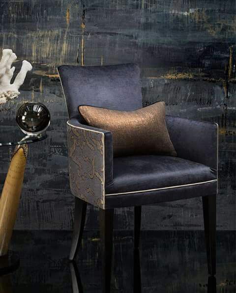 Channeling this strong effect can often be best achieved by calling on your interior designer or interior decorator for a colour consultation. Colour and its effects are not to be taken lightly. A great deal of money and effort is spent in large corporations each year working on predicting consumer markets and choosing the most effective colour for large volumes of products. It is serious business when too bland or conservative a colour shade is chosen for retail products and the public is not inspired to buy as a result. By the same token, too strident a colour choice will also have the effect of the customer not wanting the product. The product may be a very good one, but the colour strongly influences whether or not the customer will buy it and bring it into their home. How the corporate world decides to use colour is not our concern here, even though we are subtly affected by their choices in many ways every day. We do need to buy their products to use in our homes.
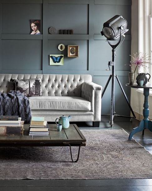 Even very pale or light colour options have a strong effect on certain clients. All colour choices have undertones and many people react to varying degrees to these subtle elements that make up the final colour shade. For instance, many people enjoy very crisp whites as part of the colour palette of their home. Shades of white that have pink, yellow, grey, blue or green undertones will be offensive to them.
  The home is the haven and resting place that we all return to after working all day or night, as the case may be, depending on our occupation. Many people work from home and always have. In recent times a lot more people have been working from home and children have been attending school from home, as well. The overall atmosphere of the home has become even more important since we are spending more time than usual at home.
Work can be tiring and stressful. After all, that is why we call it “work”. We want our homes to reflect our personality and taste, and we want to enjoy the time that we spend there and we also want to be comfortable there. That being said, we likely don’t want to sacrifice drama, elegance, charm and interest just to create a calm or serene room design. Artwork, area carpets, striking accessories as opposed to chachkas, paint colour, lighting and window coverings chosen in a creative way can result in an inspiring yet restful room design. An ideal gathering place for some people would be a room with a fireplace or a book-filled room furnished in cozy warm hues. These hues can be neutral shades. Neutrals have warm or cool undertones and the overall effect of a carefully chosen neutral is elegance, rather than boredom. A bit of sparkle doesn’t hurt either. Often, people choose beige thinking that it is a safe choice. This can backfire if the end result has no interest to the observer or if the undertones of the selected colour are undesirable. An ugly or dated neutral colour is actually stressful to live with. There is technically nothing wrong with the room. It is merely uninteresting and even bland. Generally that is not the effect that we intend in interior design projects. The neutrally decorated room above is anything but bland and boring. We don’t need to be overly dramatic either in interior design. Balance and grace are the key aims.
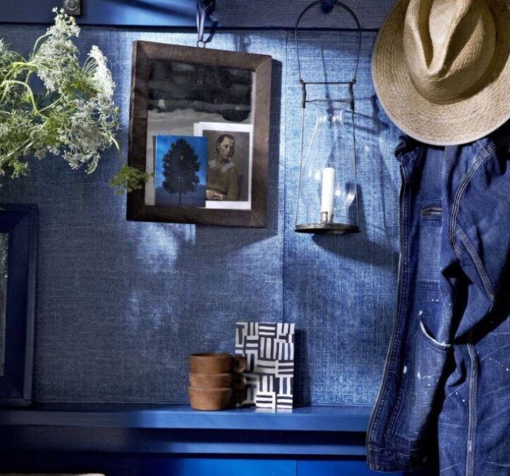
 Black is a powerful choice in interiors. When discussing the use of black with clients, often they are apprehensive, thinking that the result will be gloomy. On the contrary, black adds drama and elegance. It is also surprisingly enhancing to adjacent colours. It looks wonderful with wood. As with all aspects of interior design, we need to know when to stop. If the amount of drama that the use of black will bring to your decor will be stressful to you, there are plenty of other great colour choices to consider. We like what we like. Try not to be swayed by the comments of others about your final choices. It is you who are living in the home, not your visitors.
An extroverted personality may enjoy the punch of raspberry, ruby or brick red. This may be too energetic for a living room but may feel just right in a foyer, a hallway, or on one wall. Others would prefer a less intense rosy blush in order to get the same emotional effect for their room design. Many people strongly dislike pink, while just as many love it. We are drawn almost intuitively to colours that we will enjoy living with. Conversation sparkles in a dining room bathed in coral or amber, appetites are enhanced in a red room, and creativity flows in home offices and studios washed in golden yellow, lemon or jasmine. Lively greens such as lime and parrot green awaken and activate us. Greyed lime is upbeat as well as classy looking. Orange in a mellow shade can spark optimism and good cheer. Orange is actually a good colour for offices because it keeps energy elevated and a feeling of fun and creativity abounds. It is excellent in workplaces where creativity is required. It is also excellent in home offices, which can sometimes be lonely spaces, and these days many people have been working from home to a much greater degree than in the past. Colour in home decor is indeed a very powerful tool, simply because it makes up such a large percentage of the surface area of the room plan.
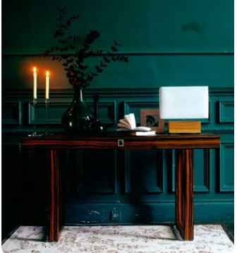 De-stressing, re-fuelling, cooling, calming of the weary spirit may occur in rooms furnished in pacifying colours such as blue, green, and purple, as well as various shades of grey. Quiet time activities take place in libraries, bedrooms and living rooms. Many bathrooms have a spa-like feel these days, also. This may take the form of a vibrant sea water blue, or it may be a more toned down shade, depending on the desired effect. Murals have become a strong trend in home decor. A wall to wall mural of sea water in a bath is a very effective way to communicate a spa-like feeling without travelling anywhere. It can even be applied to a ceiling. If paint is the colour vehicle of choice, the ideal shade of serene, watery blue may well have the desired soothing effect after a hard working day. The shade that we settle on will have a powerful effect on the room. Both rooms will be beautiful, but each one is for a different person. Glacier blue and pale azure may work meditative miracles of coolness and unstructured serenity. We may feel more connected to nature and become more grounded and refreshed with a family room, office, spa or kitchen bathed in a medium green. You may find that you are more reflective and dreamy in a room washed in pale purple/blue. Strong blues often produce a feeling of contentment as well as luxury.
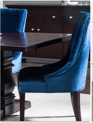 Rich purple lends a sense of drama with a touch of fun. The choices are endless. Interior design should be fun and inspiring, and the finished rooms a joy to live in. When discussing the possible use of purple, many clients at first think that purple is a tacky choice for interior design. Not so at all if the correct shade is used in the right application. Purple can be soothing or dramatic, depending how we use it. How can we have all these results in a single dwelling, you may ask? Your interior designer or interior decorator has the expertise to guide you through the myriad of colour choices, bridging them from room to room with subtle neutrals, varying intensities of colour and using whites of various shades to balance colour and maintain an expansive feel. Add a touch of black, and you raise the energy level.
Since 1993 Mulberry Interiors, headed by colour specialist and designer, Marguerite Roberts, has been assisting clients in Oakville, Mississauga, Burlington, Brampton, Milton, Georgetown, Etobicoke, western Toronto, and Vaughn. Photos are representative of the quality and creativity of work that we can do, not necessarily of our direct work. We specialize in residential interior design and decorating and are at our most creative when we use colour as our theme. We offer a full range of interior design services such as choosing paint colours, space planning, furniture sourcing, custom draperies and soft furnishings, flooring selection and accessories. Call Mulberry Interiors now at (905) 849-6423 to book a consultation. We look forward to working with you to increase your enjoyment of your home. Full Interior Decor Service.
- Paint Colour Consultations a Specialty
- Window Coverings including Draperies, Shutters, and Blinds
- Fine Furniture
- Flooring and Area carpets
- Space Planning
- Accessories, Lighting and Wall Art
